google-maps-ios-utils
Heatmap rendering
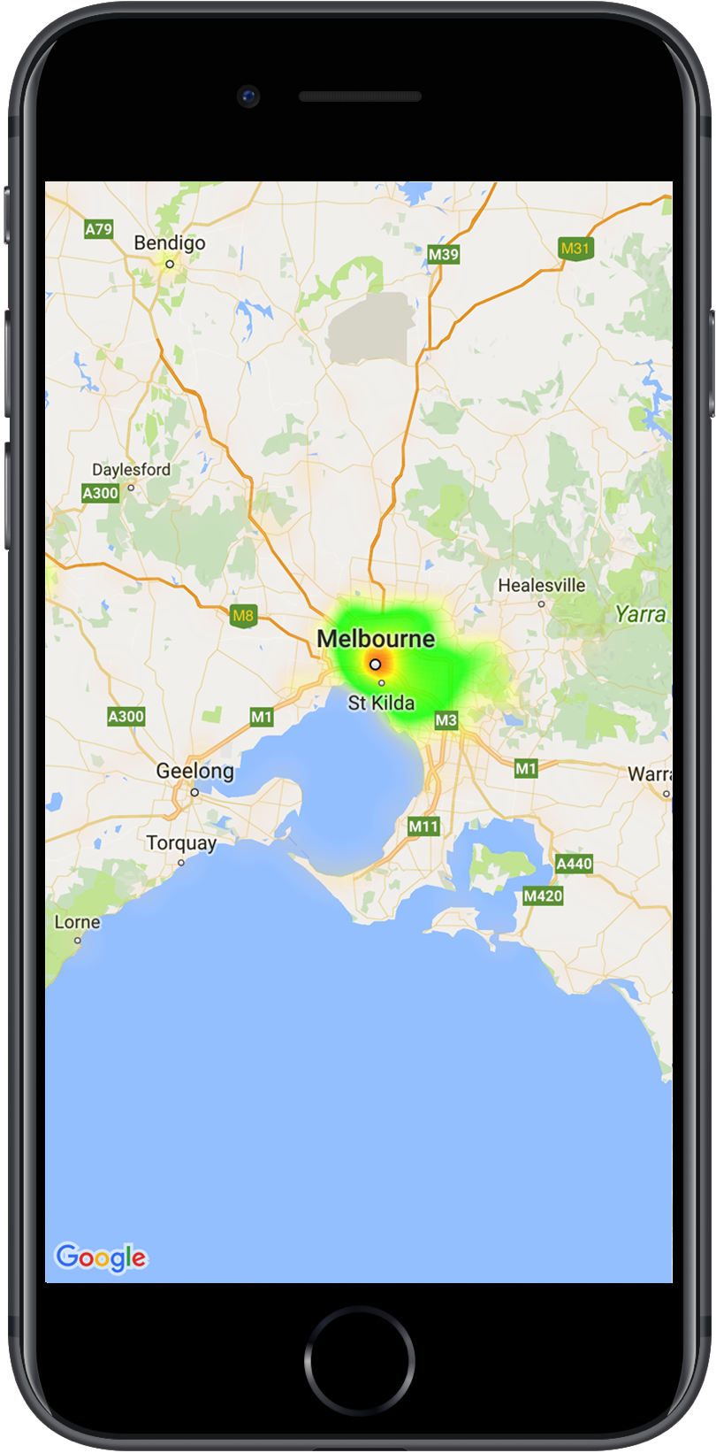
As of version 2.1.0 we have added new features for rendering heatmaps. Heatmaps make it easy for viewers to understand the distribution and relative intensity of data points on a map. Rather than placing a marker at each location, heatmaps use color to represent the distribution of the data.
In the example below, red represents areas of high concentration of police stations in Victoria, Australia.